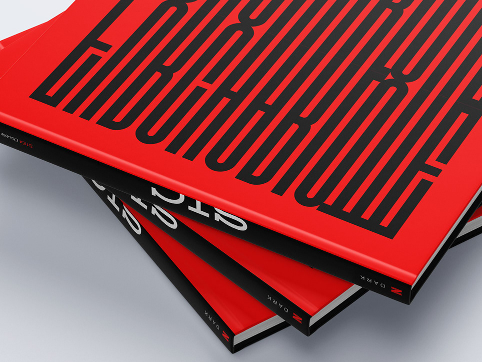
Style: Grotesque / Sans serif
Proportions: Display
Width: Condensed
Weight: Regular
Contrast: Low
Stress: Vertical
Scale-Size: +24 pt.
Proportions: Display
Width: Condensed
Weight: Regular
Contrast: Low
Stress: Vertical
Scale-Size: +24 pt.


Font based on the old signs of typical Lisbon stores from the 1930s. It has a bold, strong and
elegant appearance, with a lot of visual character.
It is a display font, condensed, geometric and whose verticality allows space saving. It has an
adaptable style over time and, depending on how it is applied, it may look more vintage or contemporary.
elegant appearance, with a lot of visual character.
It is a display font, condensed, geometric and whose verticality allows space saving. It has an
adaptable style over time and, depending on how it is applied, it may look more vintage or contemporary.
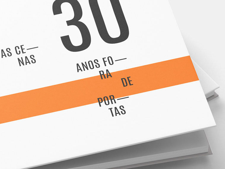
Created for Branding, Editorial and Web applications.